Data Fraud or Incompetence? |
|
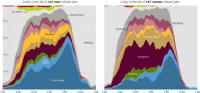
To wit: The following headline appeared in The New York Times, "How Nonemployed Americans Spend Their Weekdays: Men vs. Women." Looking to feed my sense of outrage at all the people these days who profit from my hard work, I enthusiastically read the article. A host of graphs were provided ostensibly depicting the results of a survey conducted by the U.S. Bureau of Labor Statistics titled, "American Time Use Survey Summary." Approximately 11,400 people were interviewed in detail by the BLS about how they spent their time. The number includes both 'working' and 'not working' individuals. The full dataset can be downloaded from the BLS website. I did not parse the data to discover the actual number of working versus non working participants, but considering many reports based on BLS information that only about half the working-age people in the U.S. are actually employed, you can bet the number of 'nonemployed' (in the NYT's vernacular) is greater than the 294 (147 men and 147 women) represented in the article. Methinks that the author was probably agenda-driven and cherry-picked a statistically insignificant number of data points that would influence his readers*. 294 is a 2.6% of the survey data, which is a mere 0.00018% of half the 320,126, 575 (per the real-time counter on the page) people in the United States at the time of this writing. Maybe the hand-selected data is truly representative of the entire dataset, but if so, why not include all of it? Still, the charts are very nice.
* Evidence that the author is aware of his dubious tactic is in this disclaimer at the very bottom of the article : "The individual time-use charts are constructed from unweighted microdata and therefore may not be representative of the larger population."
Posted on January 7, 2015 |